SONY PICTURE
SCOLLECTIONS
Entertainment
SCOLLECTIONS
Entertainment
Deck Design
- Logo / 3D
- Sizzle
- Animations
- Key Art
- Social / Digital Products
At Sony Pictures Television, I worked across a variety of creative disciplines, bringing my design skills to multiple areas of visual storytelling. My responsibilities ranged from 2D graphic design to 3D modeling and motion graphics, contributing to projects such as show logos, pitch decks, key art, social media graphics, sizzles, and main titles.
See Full Project ︎︎︎
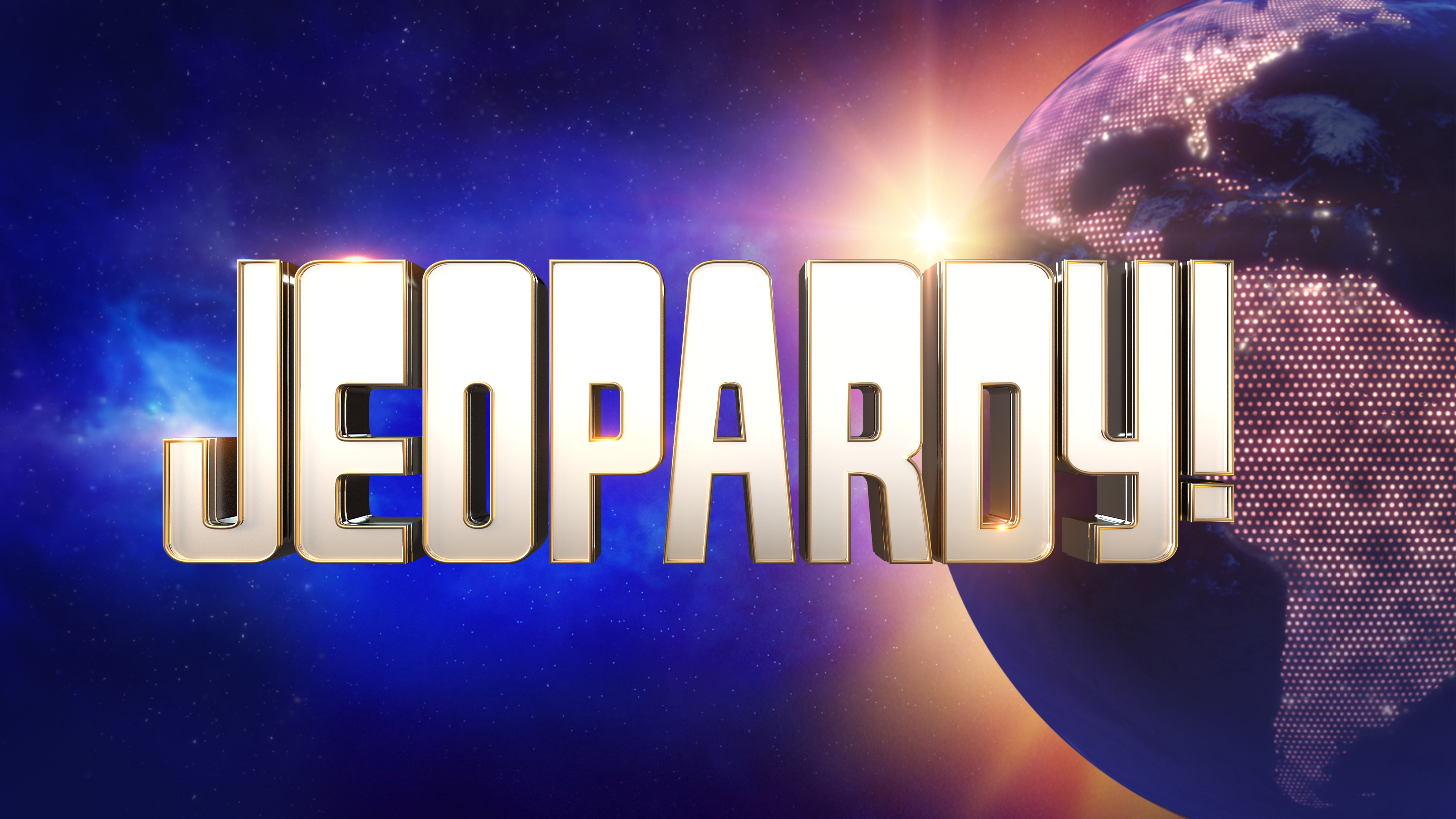

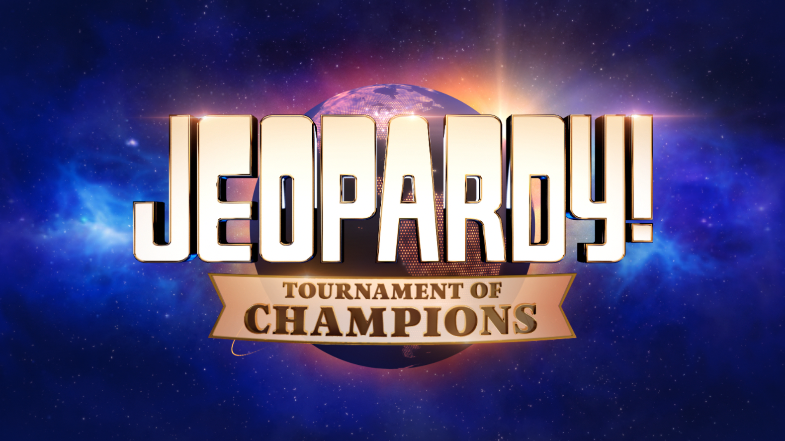

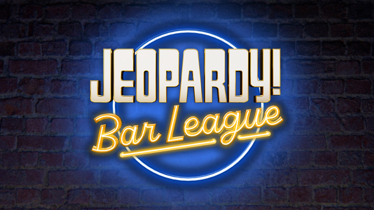
Have played a pivotal role in shaping the visual identity for the Jeopardy! brand, contributing to the design and promotion of the game show across multiple seasons (38–42).
See Full Project ︎︎︎
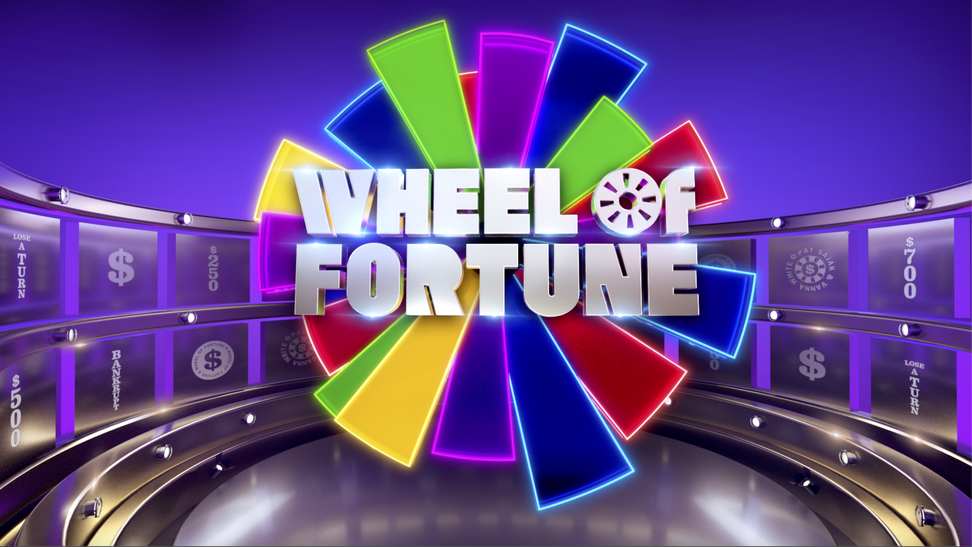
WHEEL OF FORTUNE
Broadcast
Broadcast
- Show Packaging
- Main Titles
- In-show Graphics
- On Air Graphics
- Promotional Materials
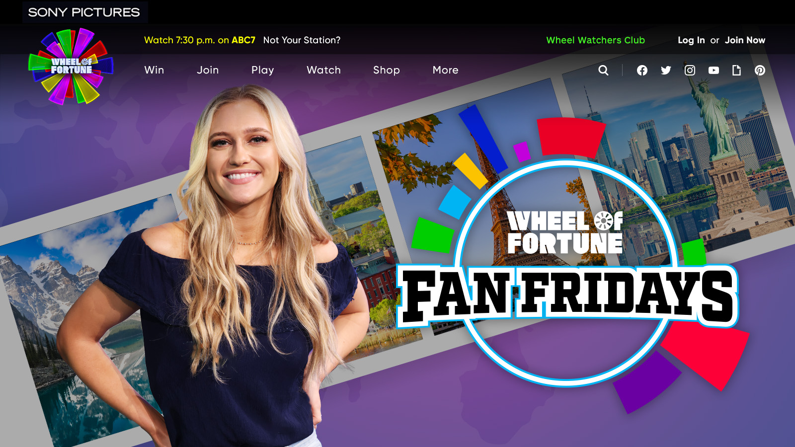
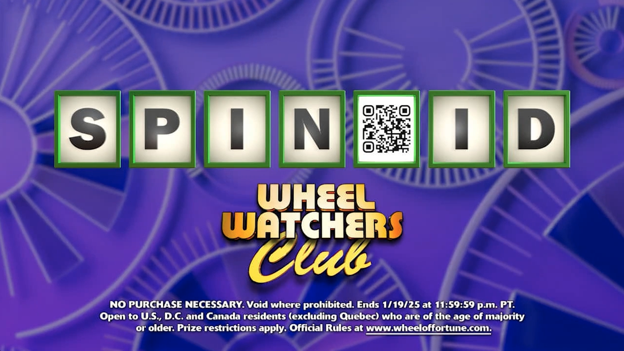
As the designer for Wheel of Fortune during Season 39–42, I was responsible for developing and refining in-show graphics packaging to elevate the visual experience of this iconic American game show. My role involved updating and refreshing key visual elements, including the Wheel of Fortune logo, main title designs, and graphics for the social each season.
See Full Project ︎︎︎

JEOPARDY! NCC
Broadcast,
Tournaments
Broadcast,
Tournaments
- Show Packaging
- Main Titles
- In-show Graphics
- On Air Graphics
- Promotional Materials
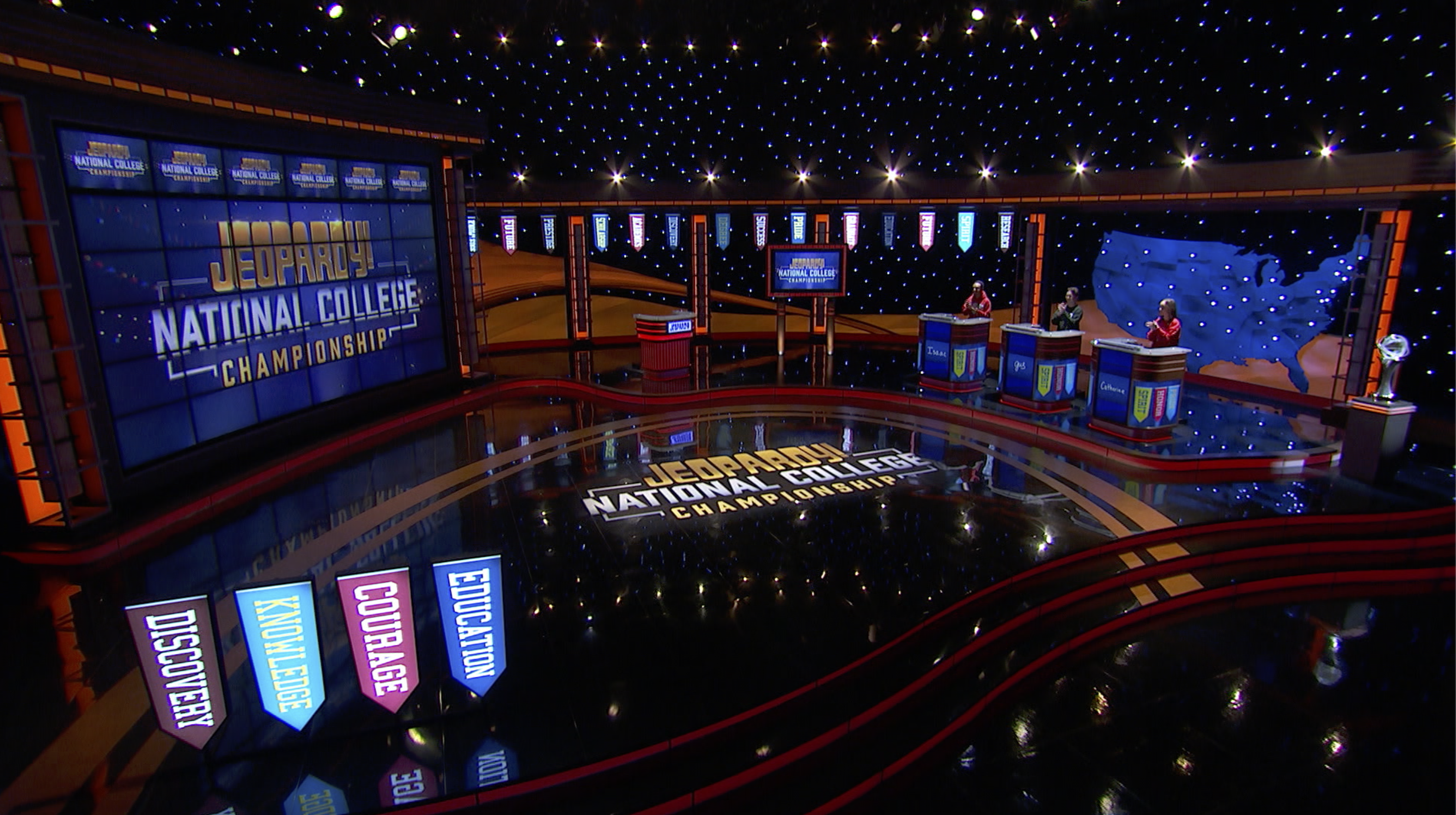
As the designer/animator for the Jeopardy! National College Championship, a special Jeopardy! spinoff, I was responsible for overseeing all visual elements that defined the show’s unique brand identity. This competition, which exclusively invited college students as contestants, required fresh and engaging visuals that would resonate with a younger audience.
See Full Project ︎︎︎
JEOPARDY! MASTERS
Broadcast,
Tournaments
Broadcast,
Tournaments
- Show Packaging
- Main Titles
- In-show Graphics
- On Air Graphics
- Promotional Materials
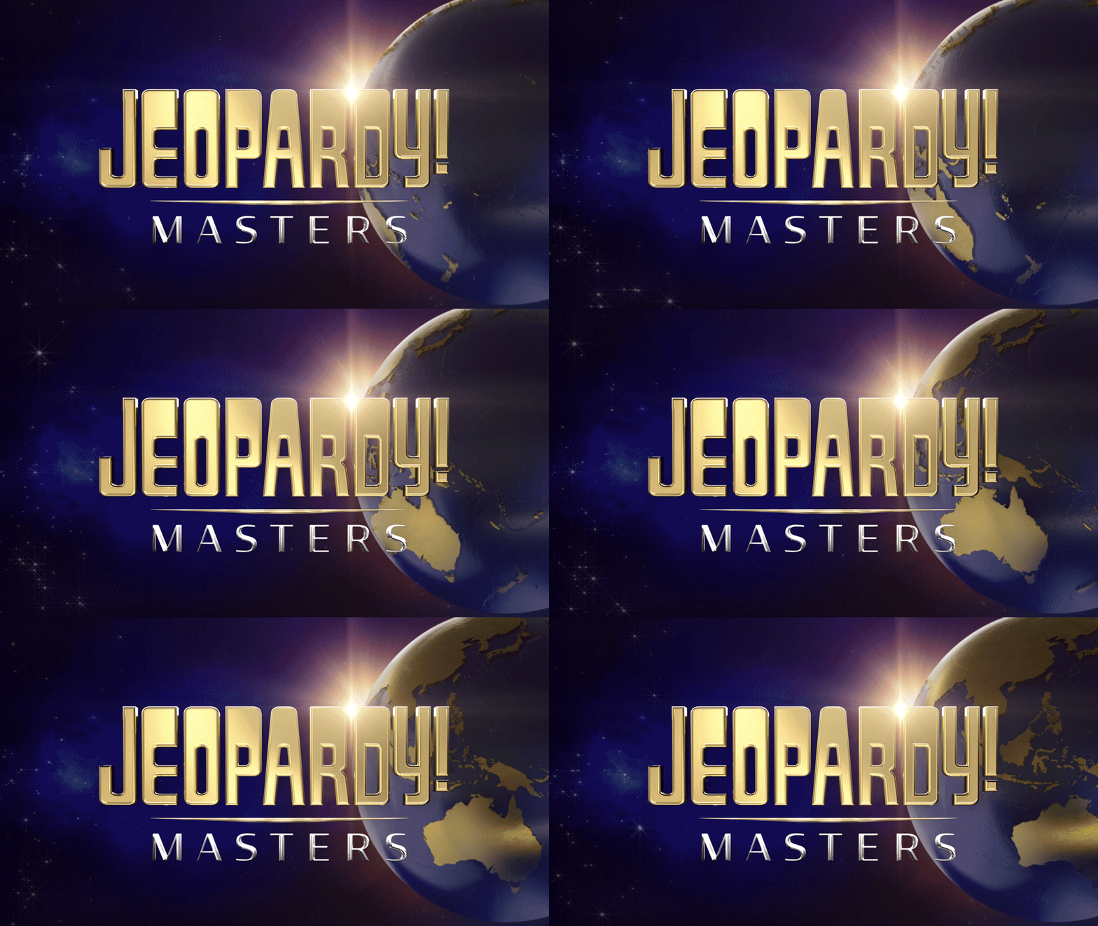
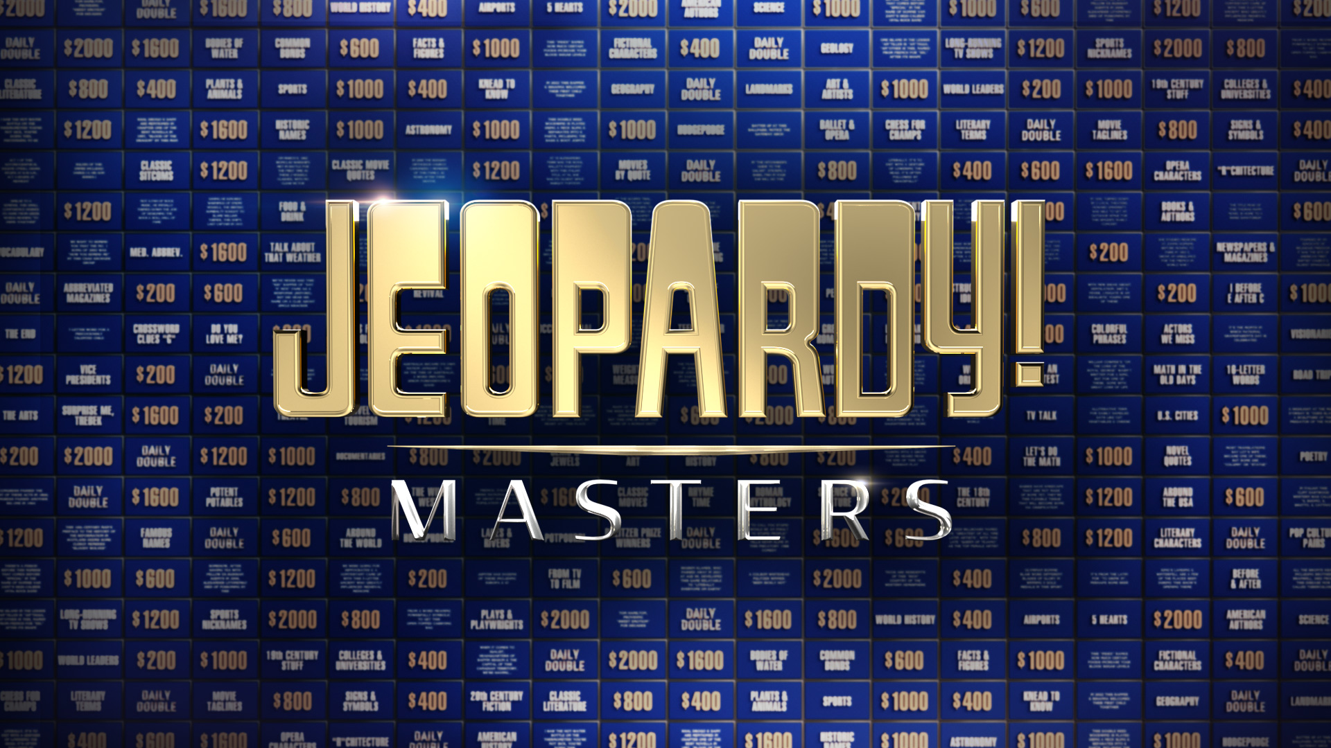
For the Jeopardy! Masters spinoff tournament, I was responsible for the development of the key visual identity and overall show packaging. This special event, which invited six of the most iconic contestants from Jeopardy! history to compete for the title of ultimate champion, required a refined, high-end design approach.
See Full Project ︎︎︎
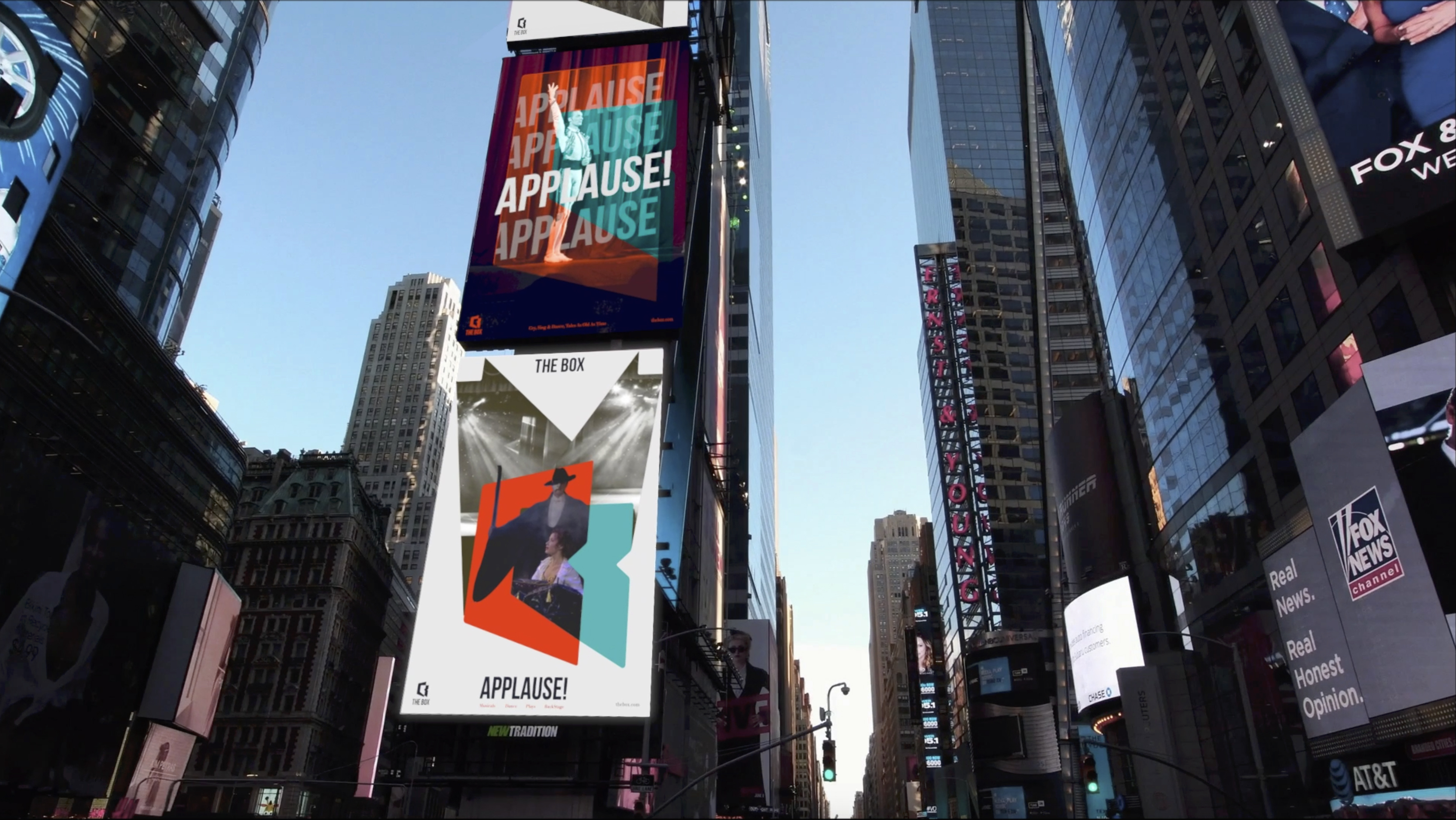
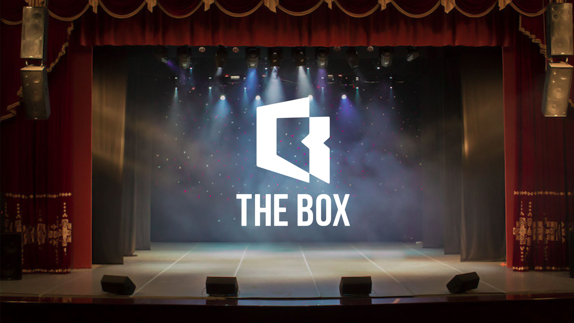
THE BOX is a new identity system for Broadway HD, a streaming service that focuses on stage-based performances such as musicals, plays, and concerts. The box continuously thinks about how to deliver the vivid experiences of the performing shows directly to users.
See Full Project ︎︎︎
See Full Project ︎︎︎

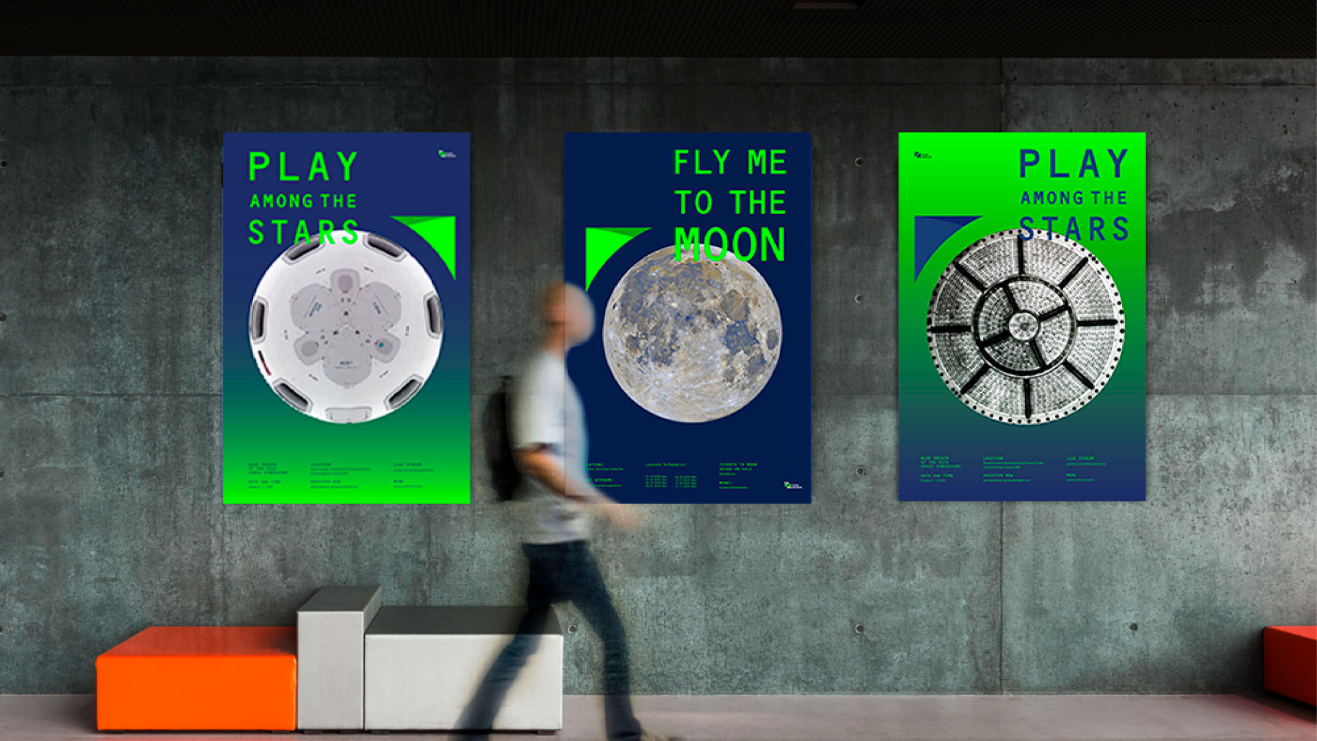
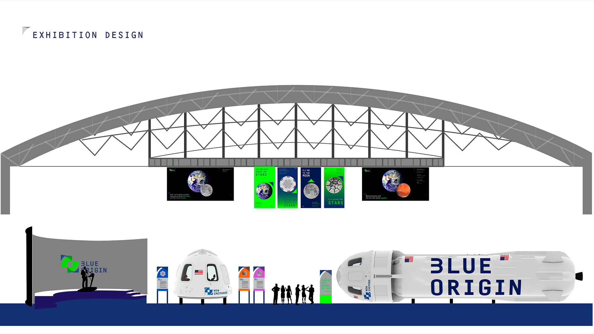
Blue Origin, the aerospace company, strives to expand the life of humankind into space. The new identity system makes the brand’s image more friendly to a broader audience and supports the perception that the space can be affordable.
See Full Project ︎︎︎
See Full Project ︎︎︎
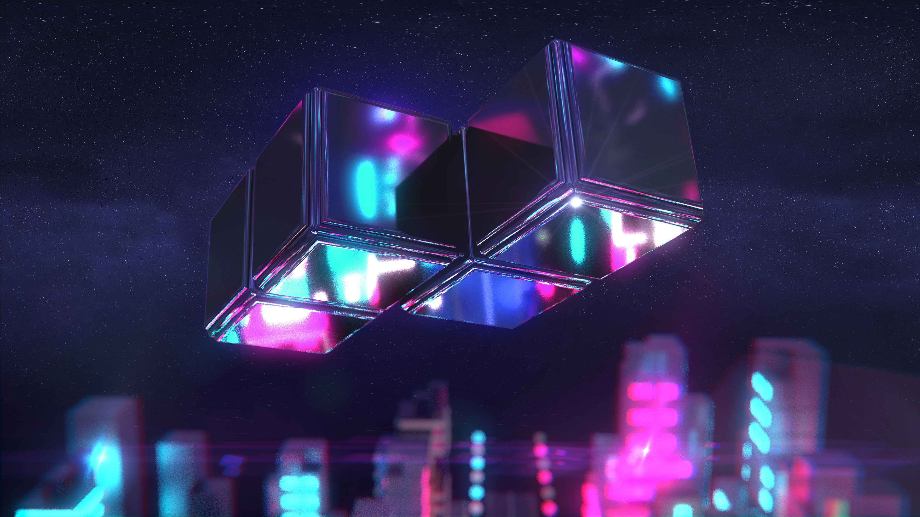
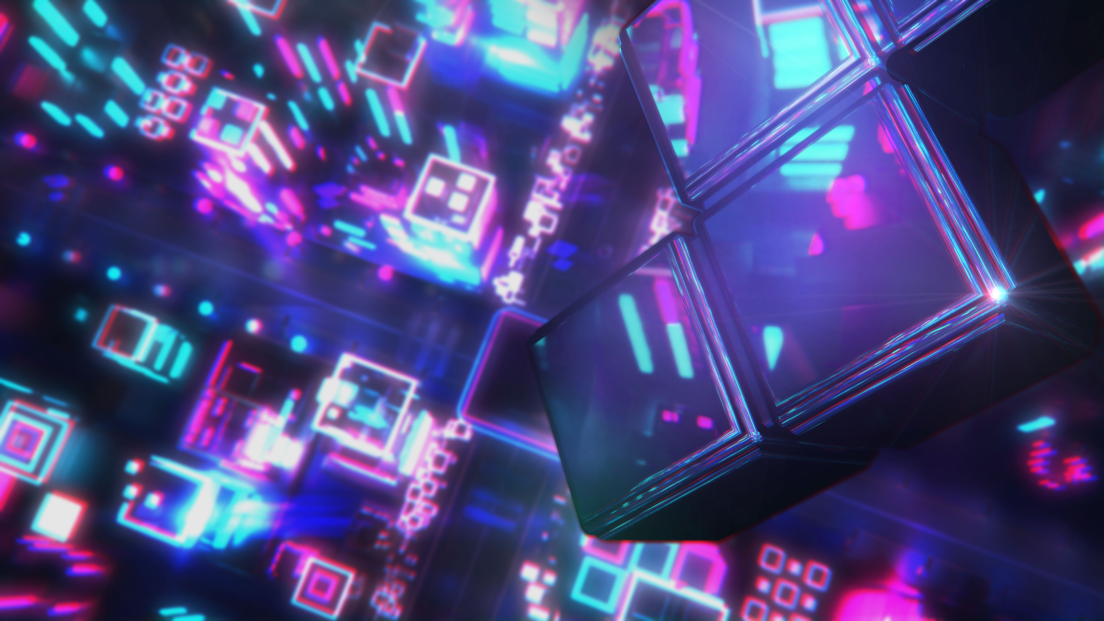
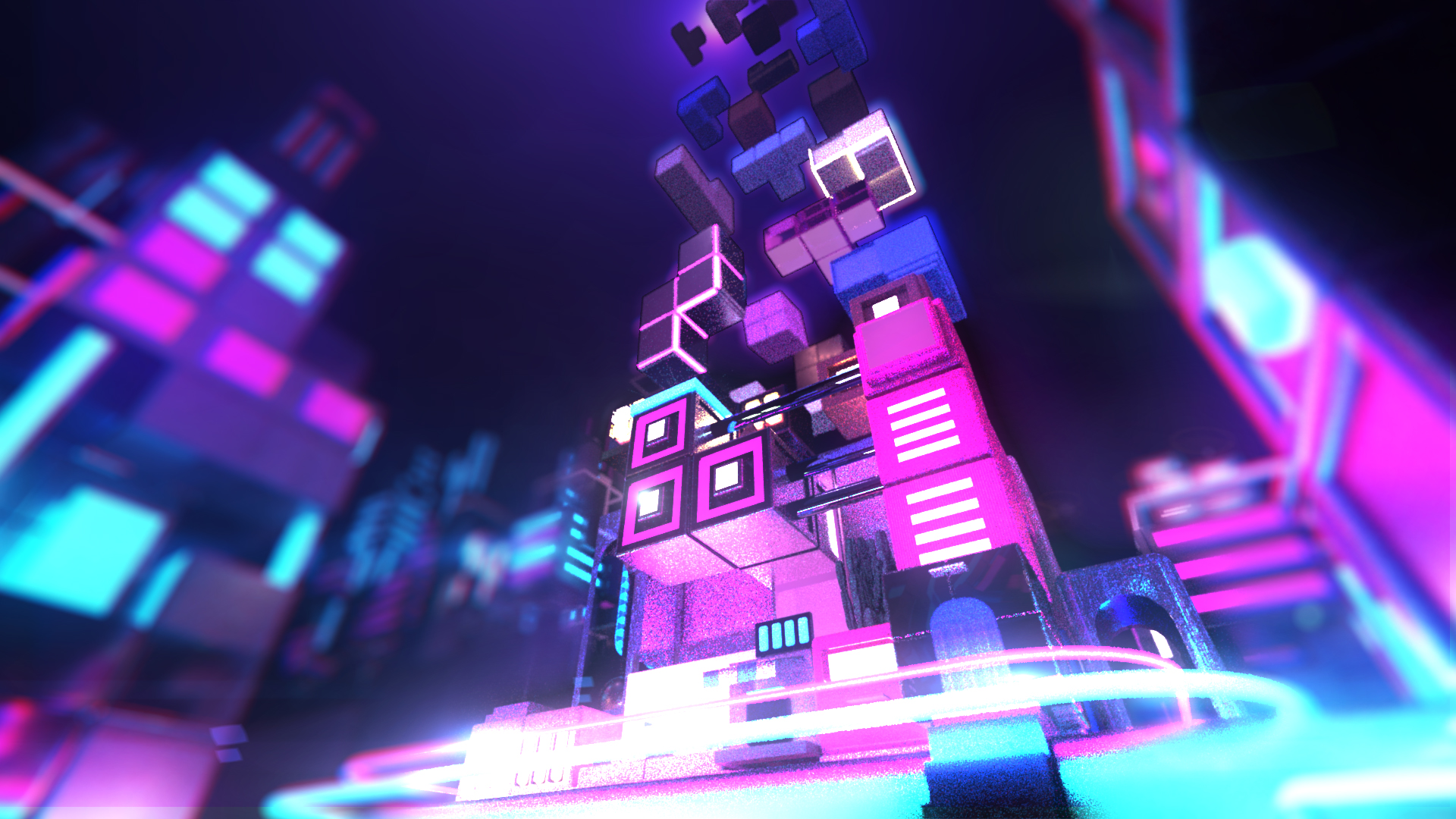
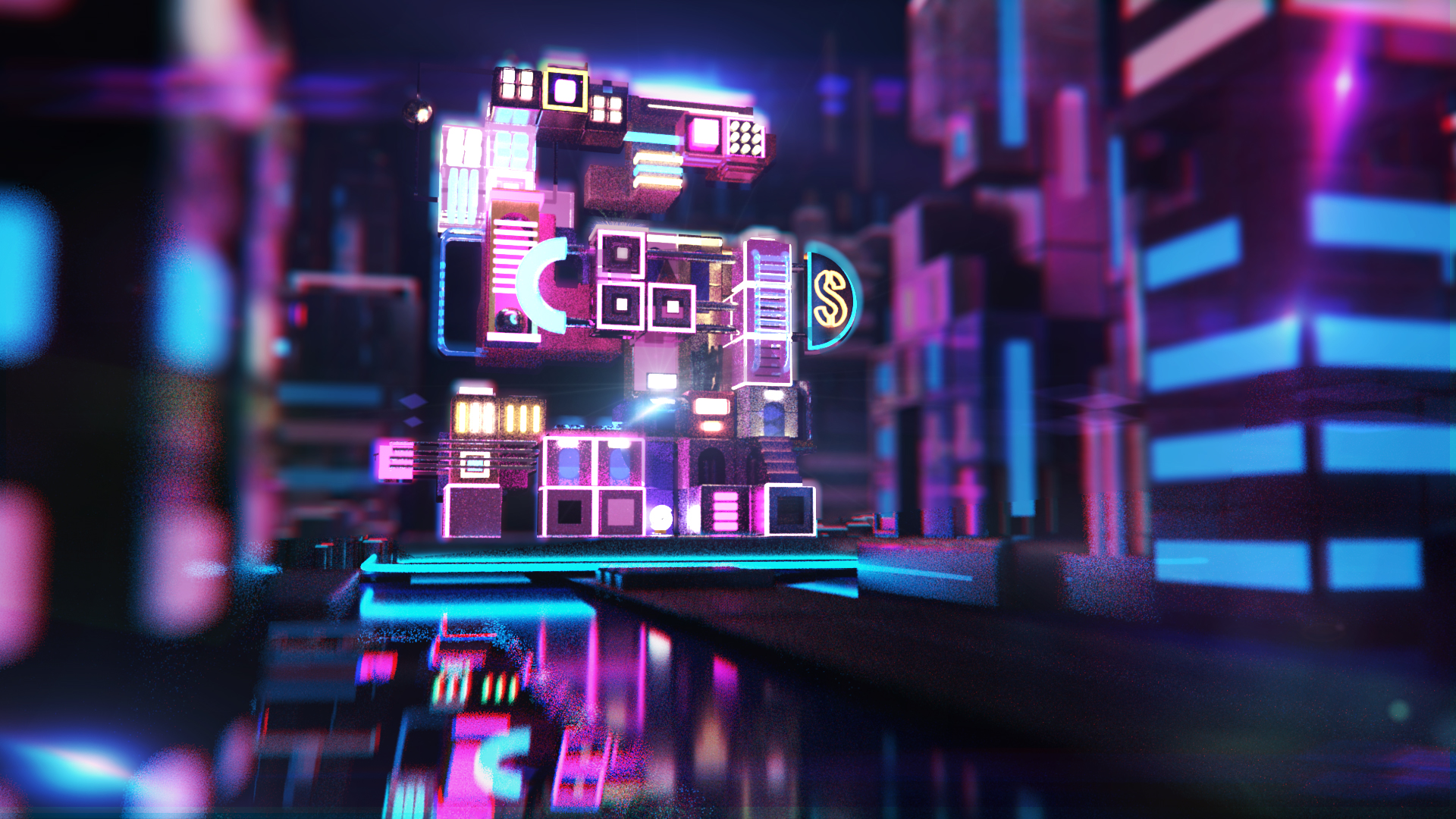
The obsession is the self-portrait sequence that creates the letter “S.” This sequence conveyed the positive side of the obsession by indicating that it can be a fun ritual, not just a dark obsession. The Tetris game is used as a framing device, and it symbolized the habit visually.
See Full Project ︎︎︎
See Full Project ︎︎︎
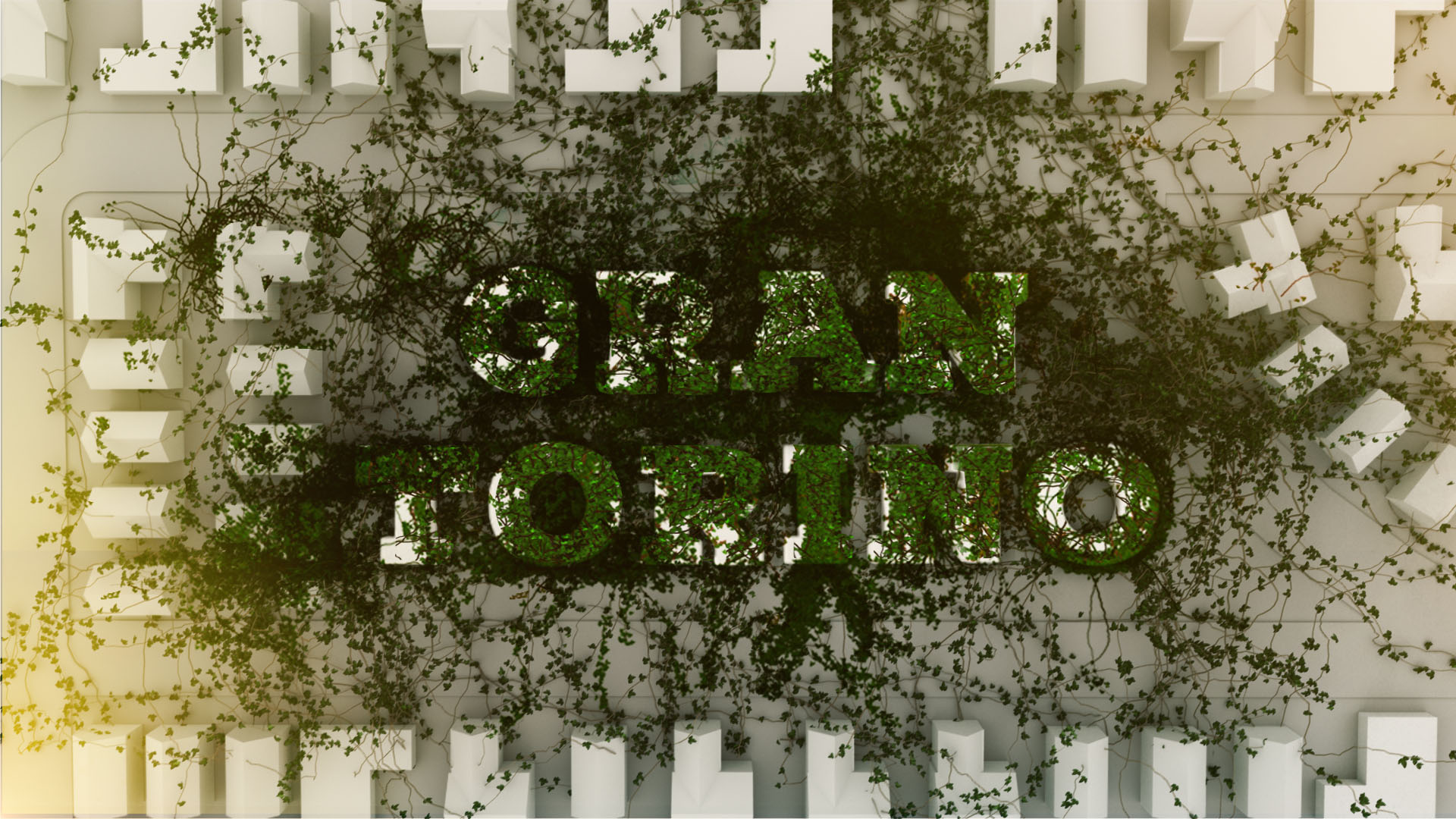
Gran Torino is a title sequence that depicts the progression of Walt’s character gradually being softened by the community around him.
See Full Project ︎︎︎
See Full Project ︎︎︎
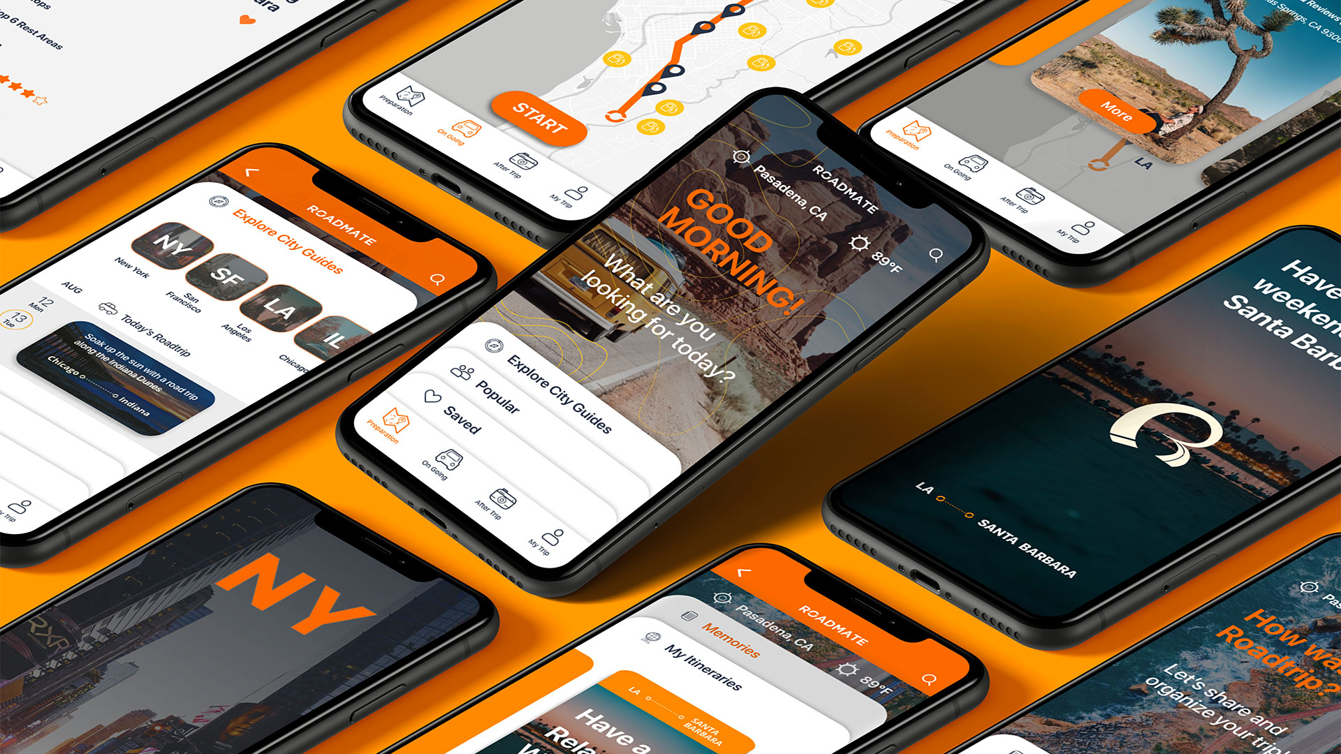
RoadMate is a road trip managing app that guides discovery, planning, traveling, and sharing of their road trip experiences.
See Full Project ︎︎︎
See Full Project ︎︎︎
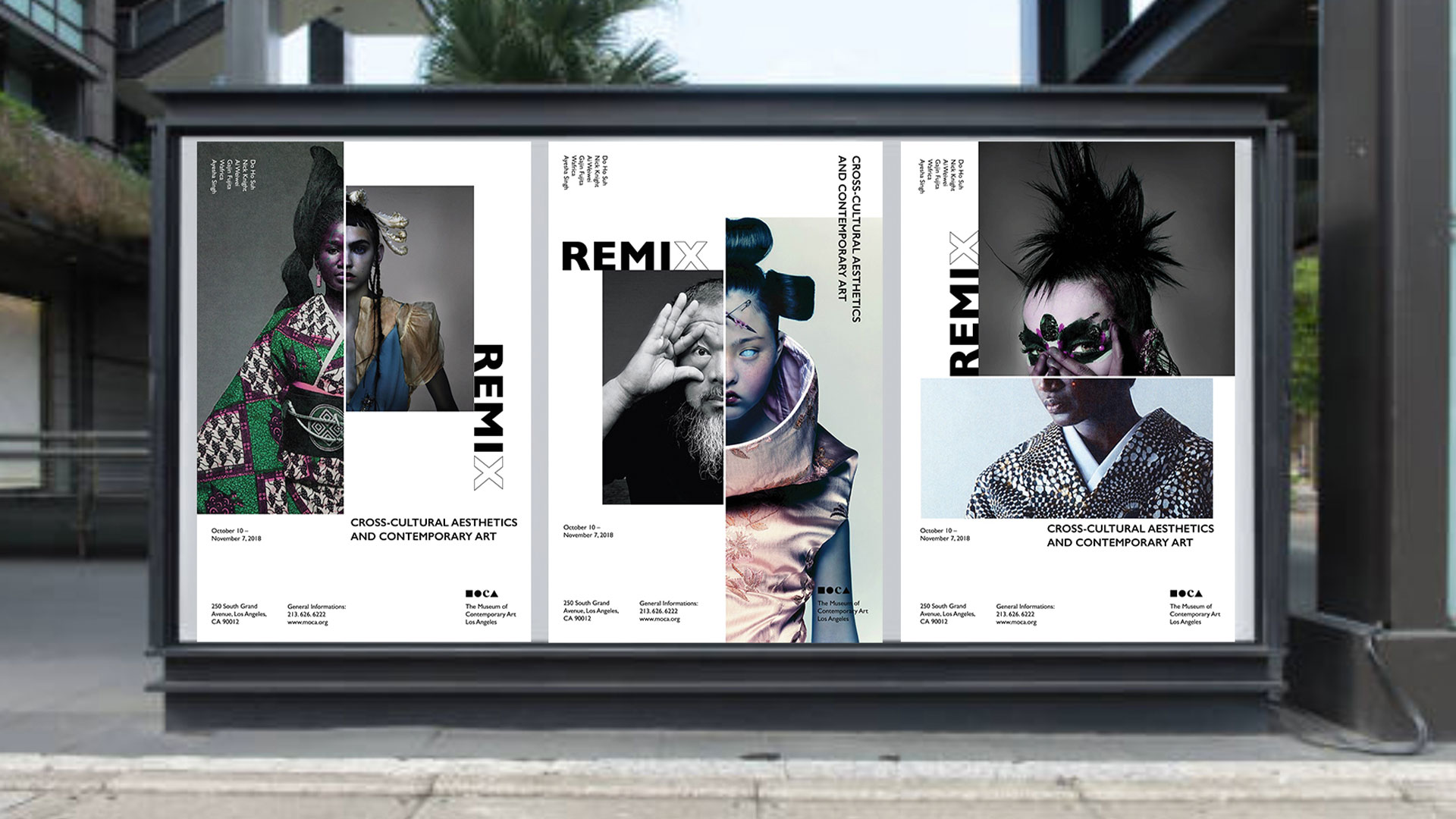


REMIX: Cross-cultural aesthetics and contemporary art is a hypothetical exhibition that introduced six artists who showcased cultural fusion in their work.
See Full Project ︎︎︎
See Full Project ︎︎︎


Bloom* is a typeface for people who bloom their imagination in empty spaces. Inspired by nature’s harmony and unpretentiousness, Bloom has the delicacy and flourishing its charm gradually and steadily.
See Full Project ︎︎︎
See Full Project ︎︎︎


