BLUE ORIGIN
: Brand Identity SystemInstructor
: Gerardo Herrera
Recognition
HOW International Design Awards
: Merit Winners in the Student Work Category
: HOW Magazine
BRIEF
Blue Origin, the aerospace company, strives to expand the life of humankind into space. The new identity system makes the brand’s image more friendly to a broader audience and supports the perception that the space can be affordable.
CONCEPT
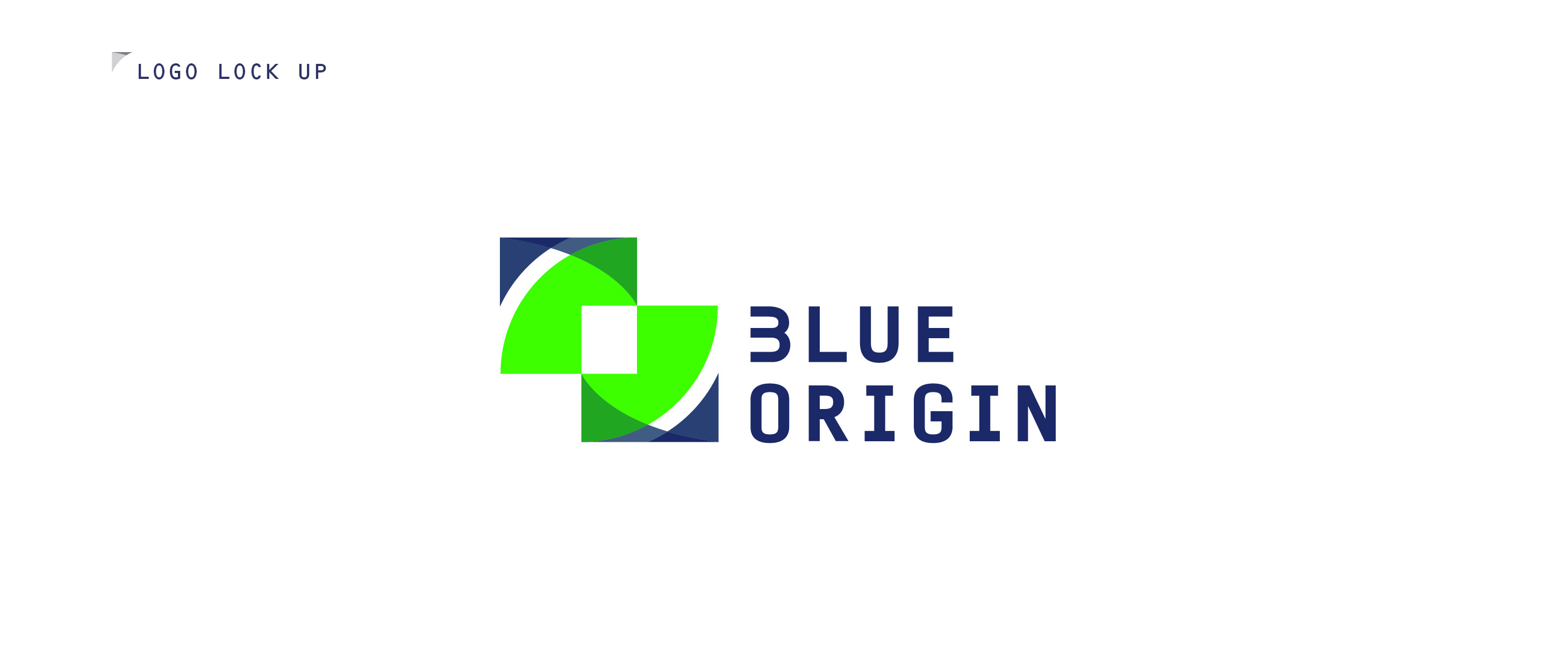
The new identity system for Blue Origin represents 'Eternity' in its symbol. The two connected forms of the logo mark express a continuum that reinforces their vision of the eternal expansion of millions of people in space. The mark inspires trust while providing the exceptional experience of living in the infinite galaxy.


IDENTITY DEVELOPMENT
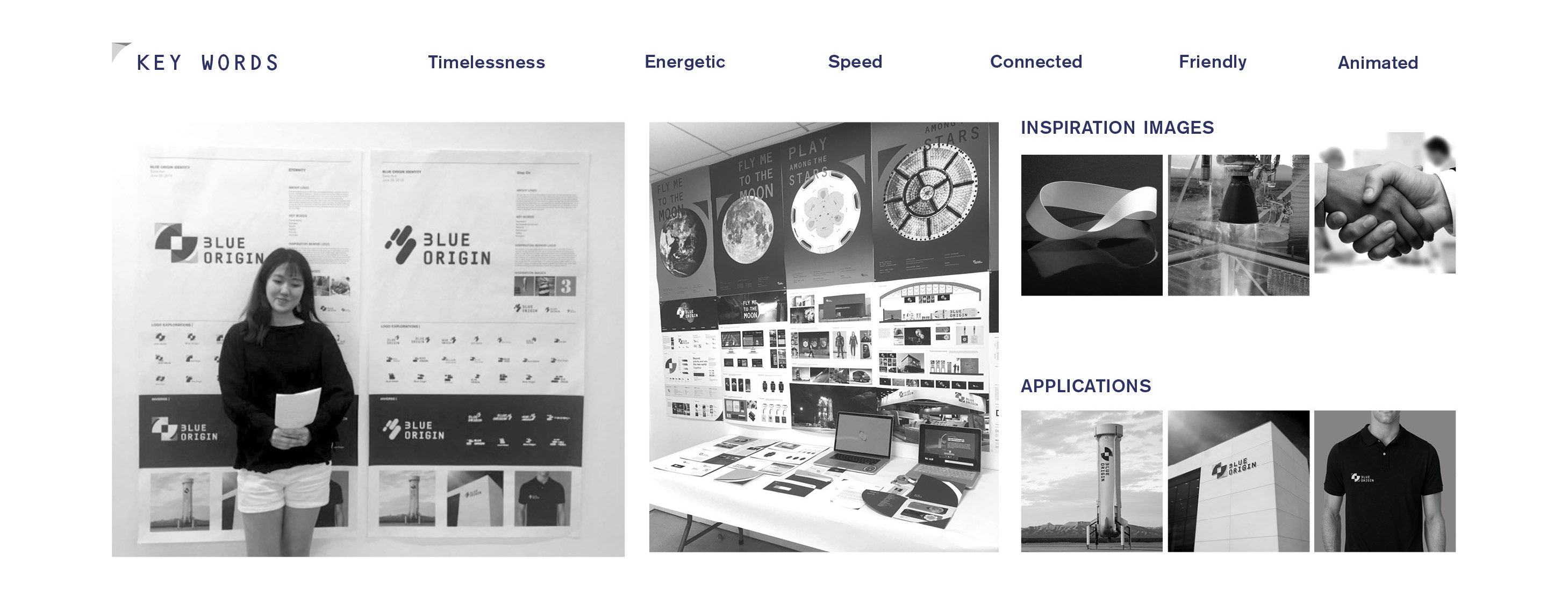
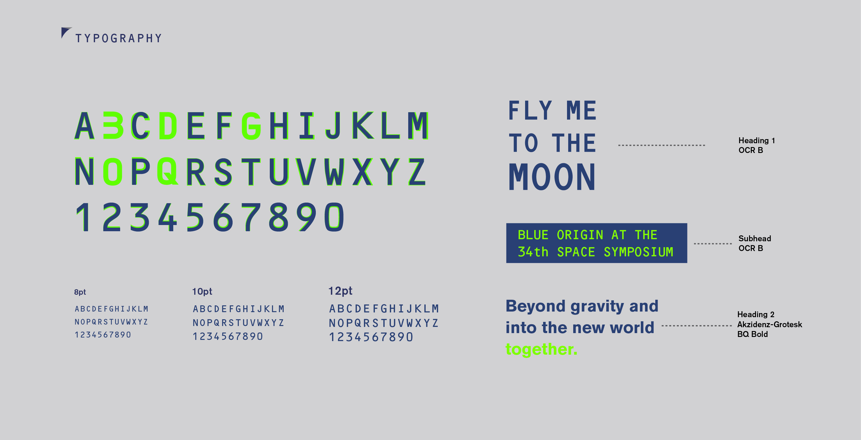
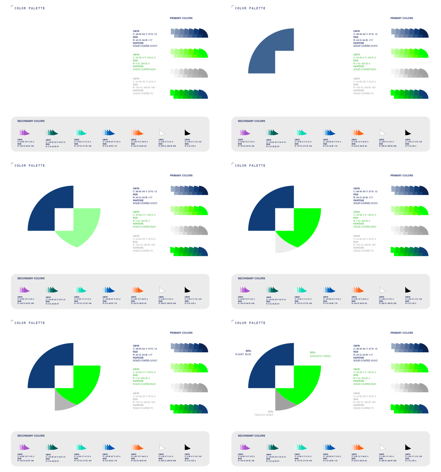
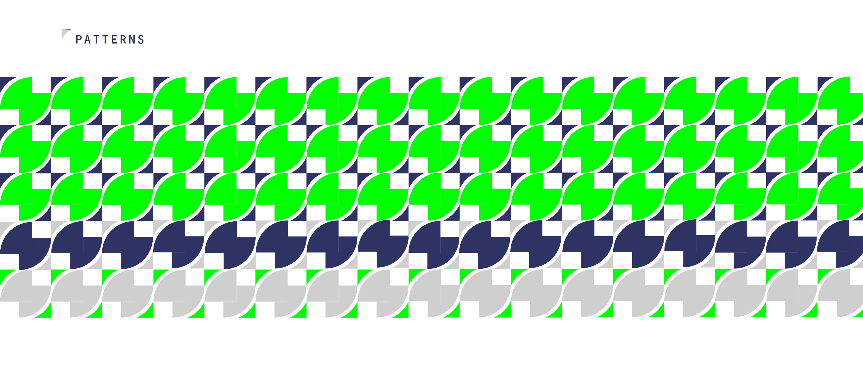
GRAPHIC ELEMENTS: Typography, Color Palette, and Pattern
![]()
![]()
![]()
AR POSTER SERIES
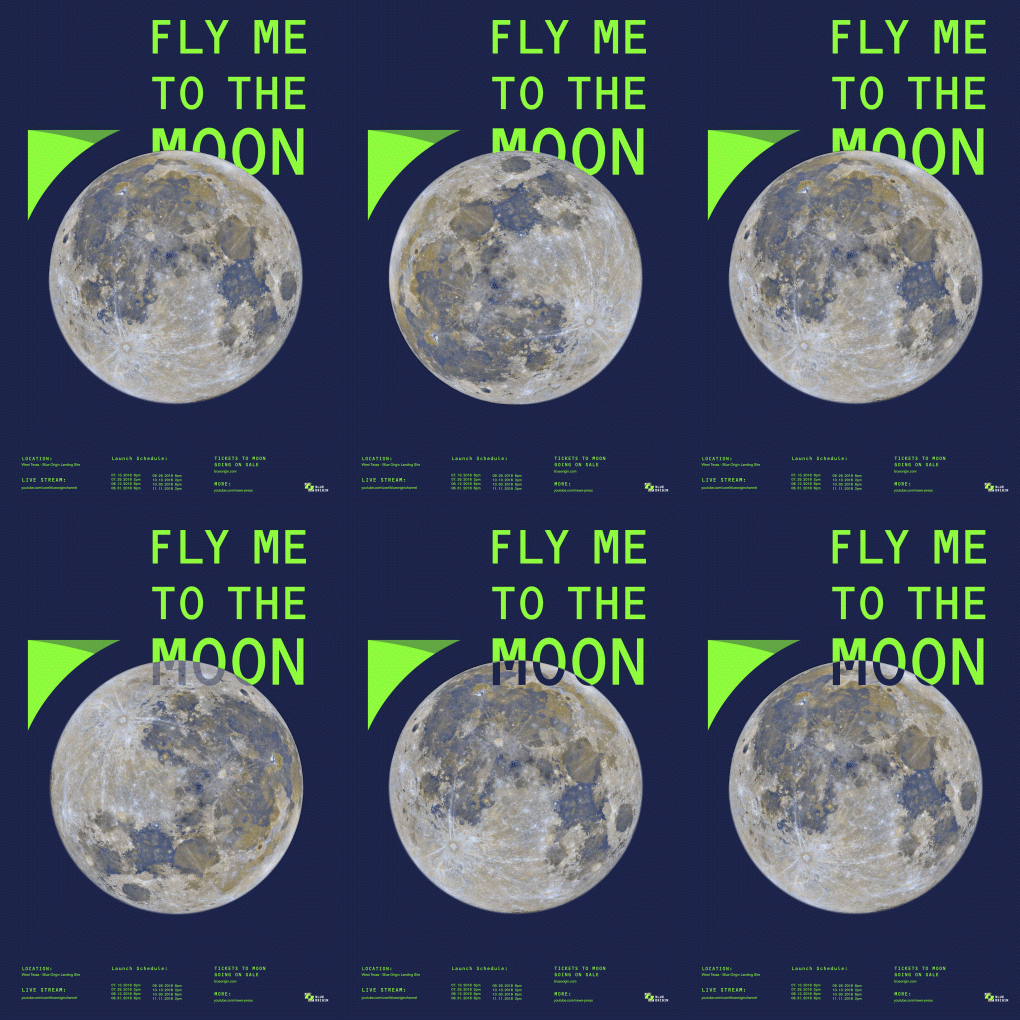
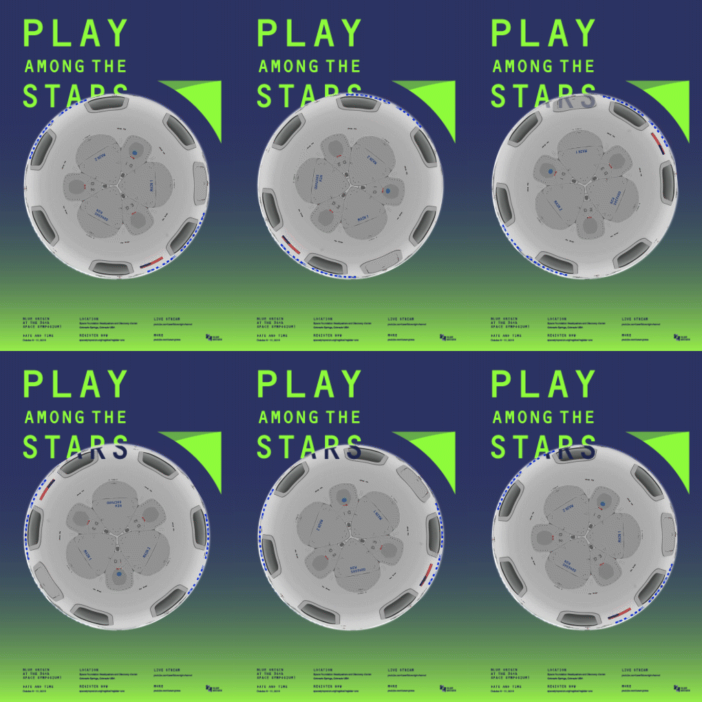
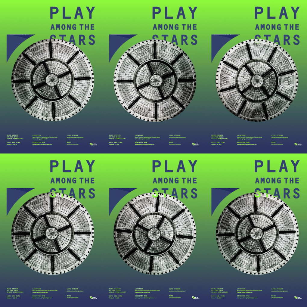
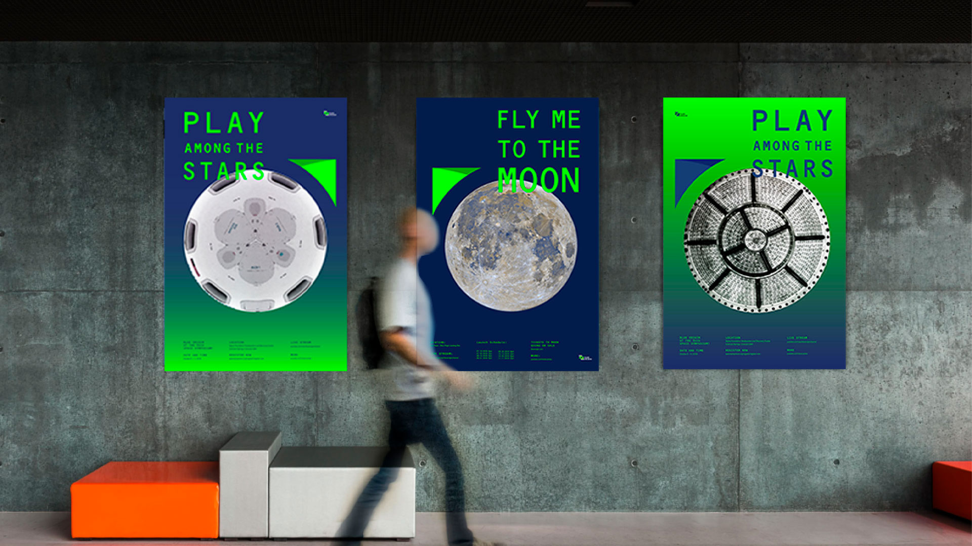
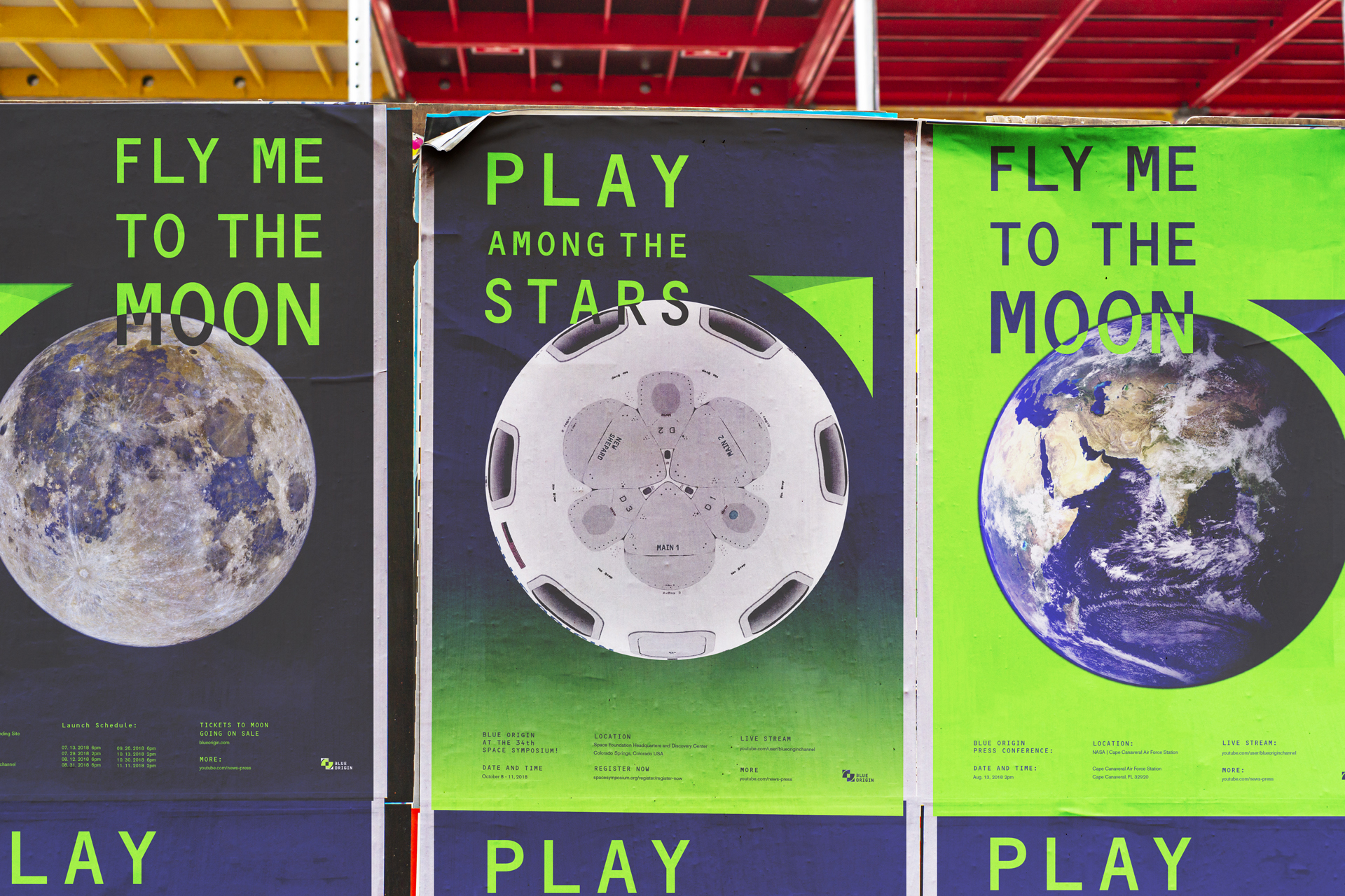
Interactive poster series provide AR service. Scan the round parts of the poster series, and People can quickly get information from Blue Origin’s new launch show events or latest news.
![]()
![]()
![]()
![]()
![]()
Interactive poster series provide AR service. Scan the round parts of the poster series, and People can quickly get information from Blue Origin’s new launch show events or latest news.


DIGITAL PRODUCTS
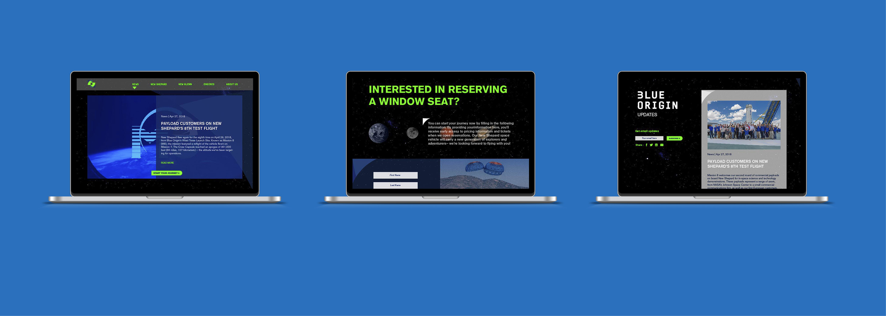
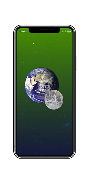
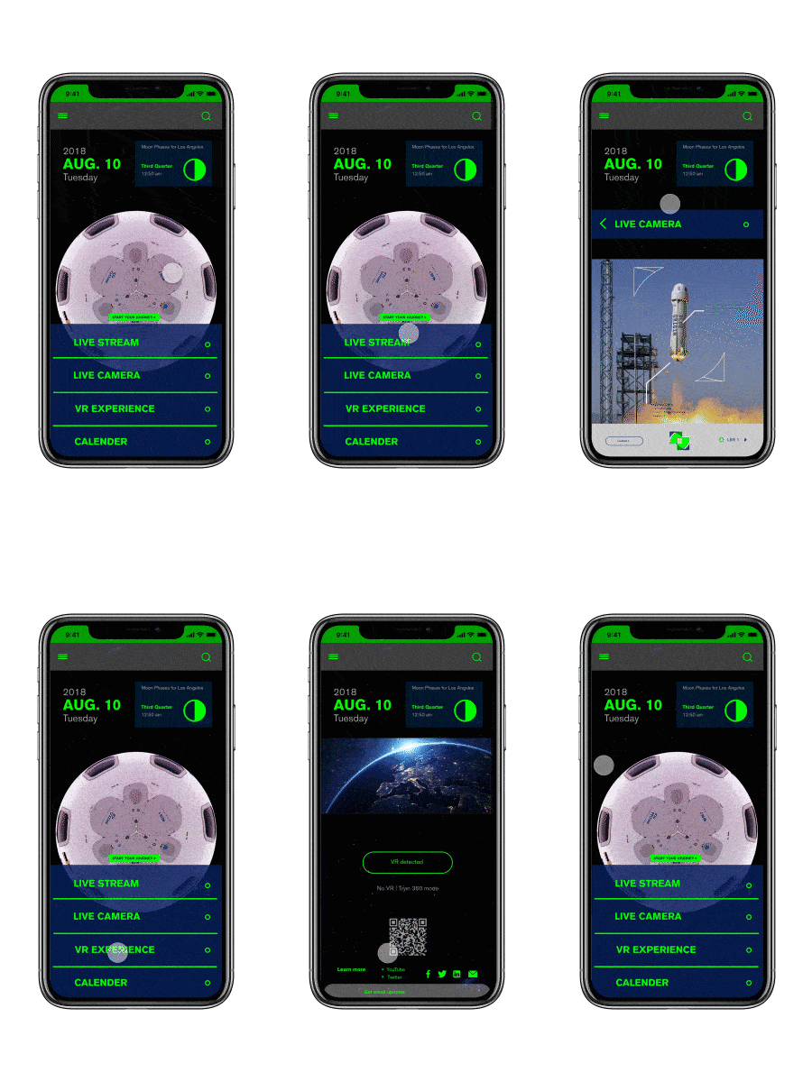
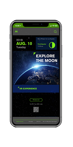
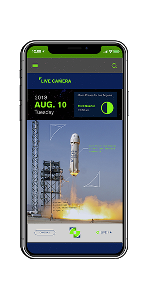
Through the website, customers can reach Blue Origin more easily. The new web provides more detailed information about Blue Origin and a new booking page for the space flight.

RANGE OF APPLICATIONS
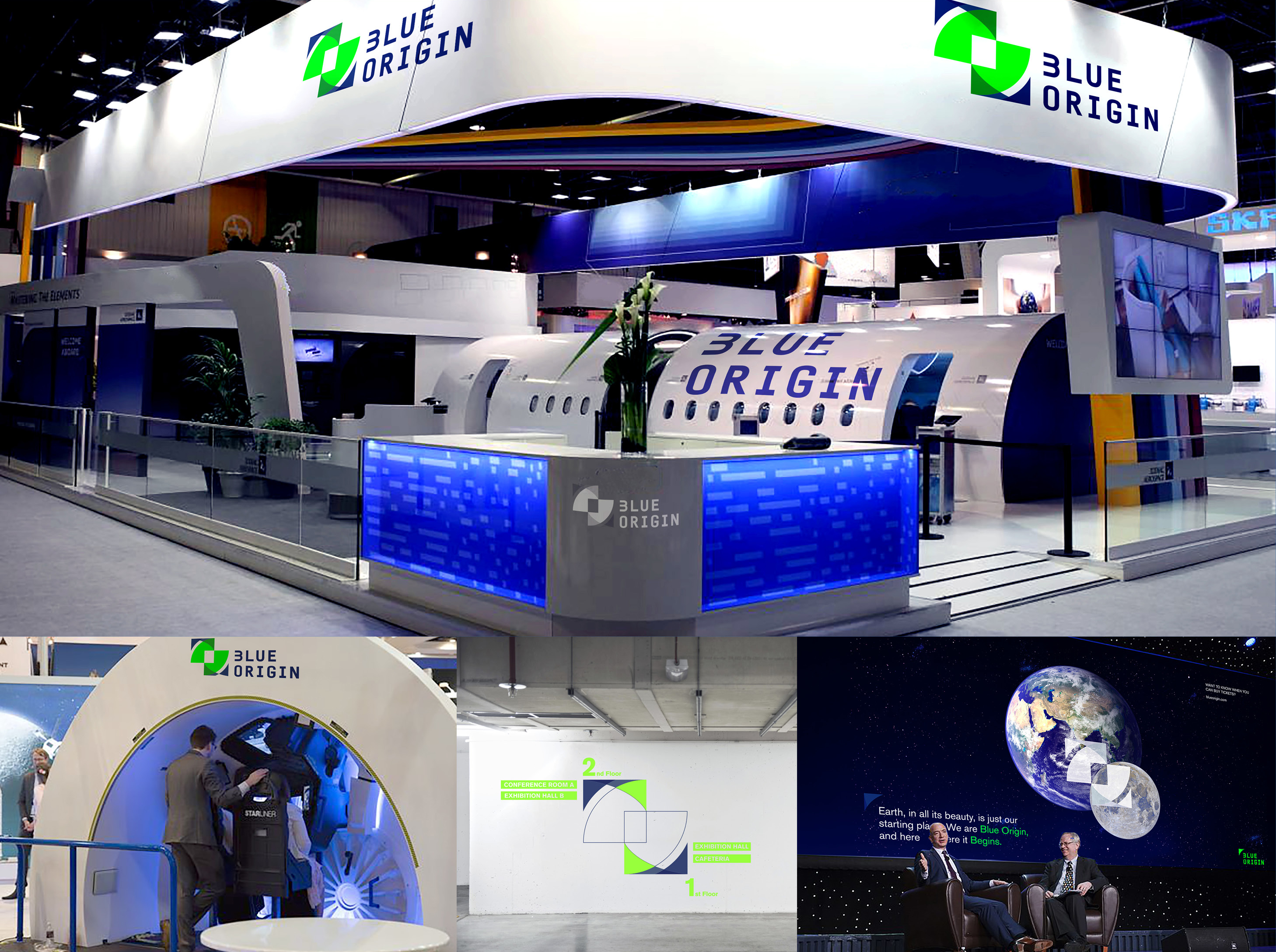
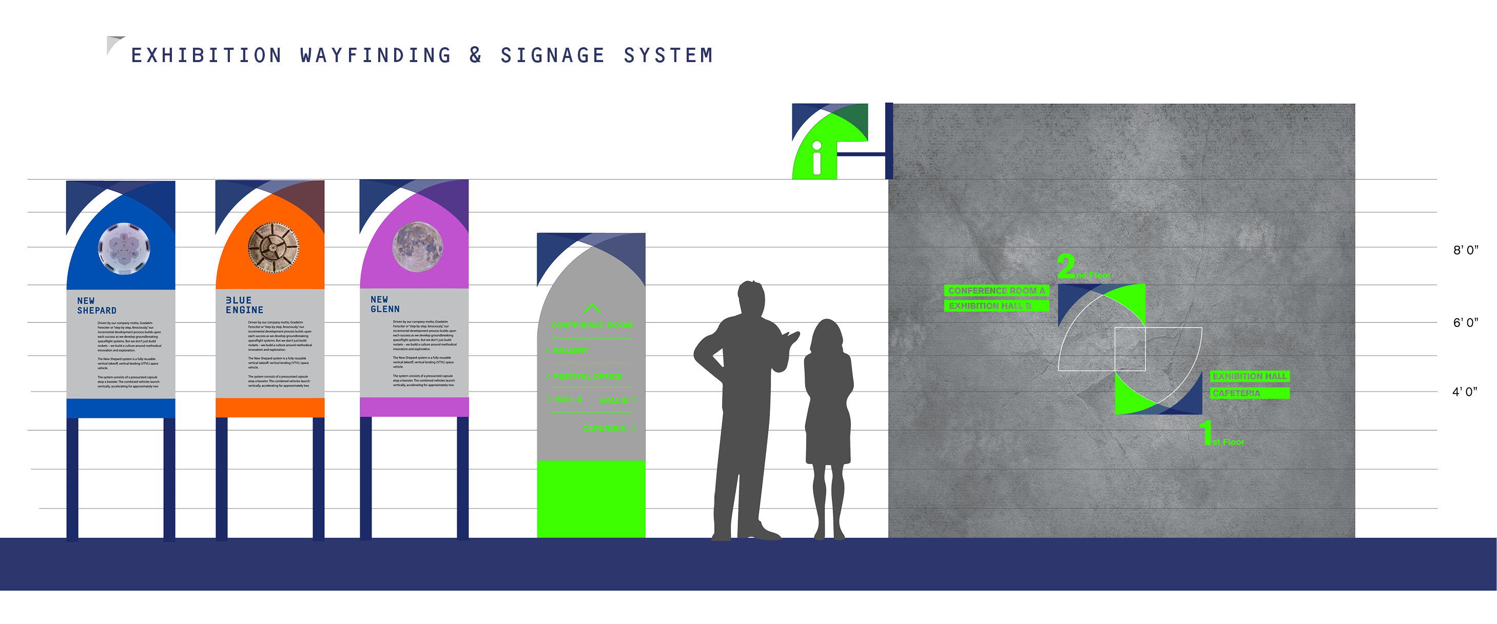
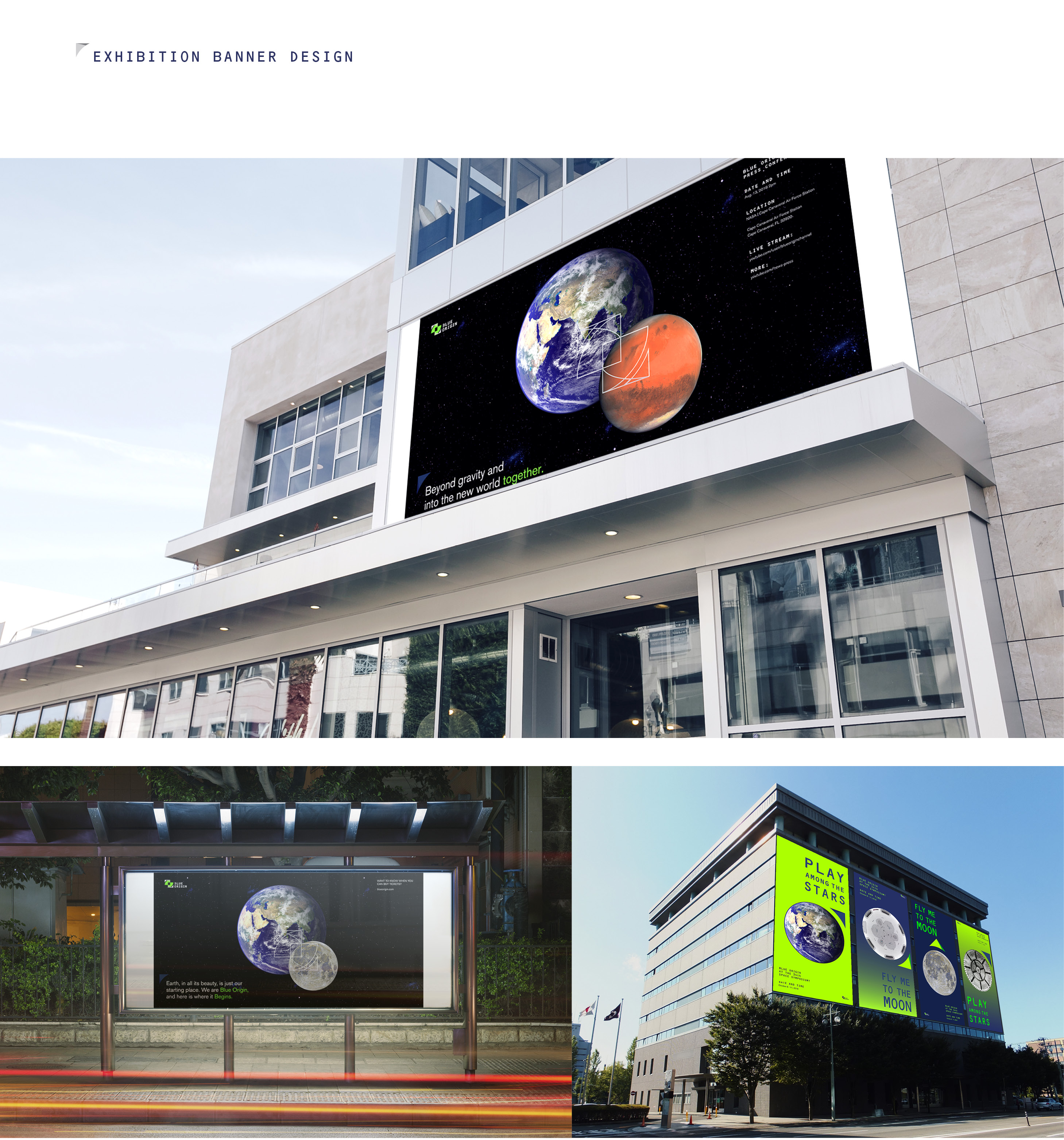
EXHIBITION: SPACE SYMPOSIUM
Blue Origin's exhibition 'Space Symposium' introduces itself to potential customers at the conference. This exhibition consists of showing rockets which are the future carriers, and the announcement of Blue Origin's new plan for space flight.

